Building And Testing The Prototype
Using our User Flow and Wireframe sketches we built out our prototype and tested it. Within the time constraints, we were able to accomplish two rounds.
Learning From Our Prototypes
Fortunately, we did not have to create all of prototype 1 to find out that color was not our friend. We received early feedback and realized the color was not helping the user to find and follow the flow.
User Testing From Prototype 1
User testing provided a lot of tasks for us to work on. Some of the more notable things we learned:
Buttons needed to be more consistent
Improve text readability
Users preferred the flexibility of an event-driven app rather than a sequential app.
Color and background images were distracting and did not help the user figure out how to navigate the app.
A bottom navigation bar is needed.
Improve text readability
Users preferred the flexibility of an event-driven app rather than a sequential app.
Color and background images were distracting and did not help the user figure out how to navigate the app.
A bottom navigation bar is needed.
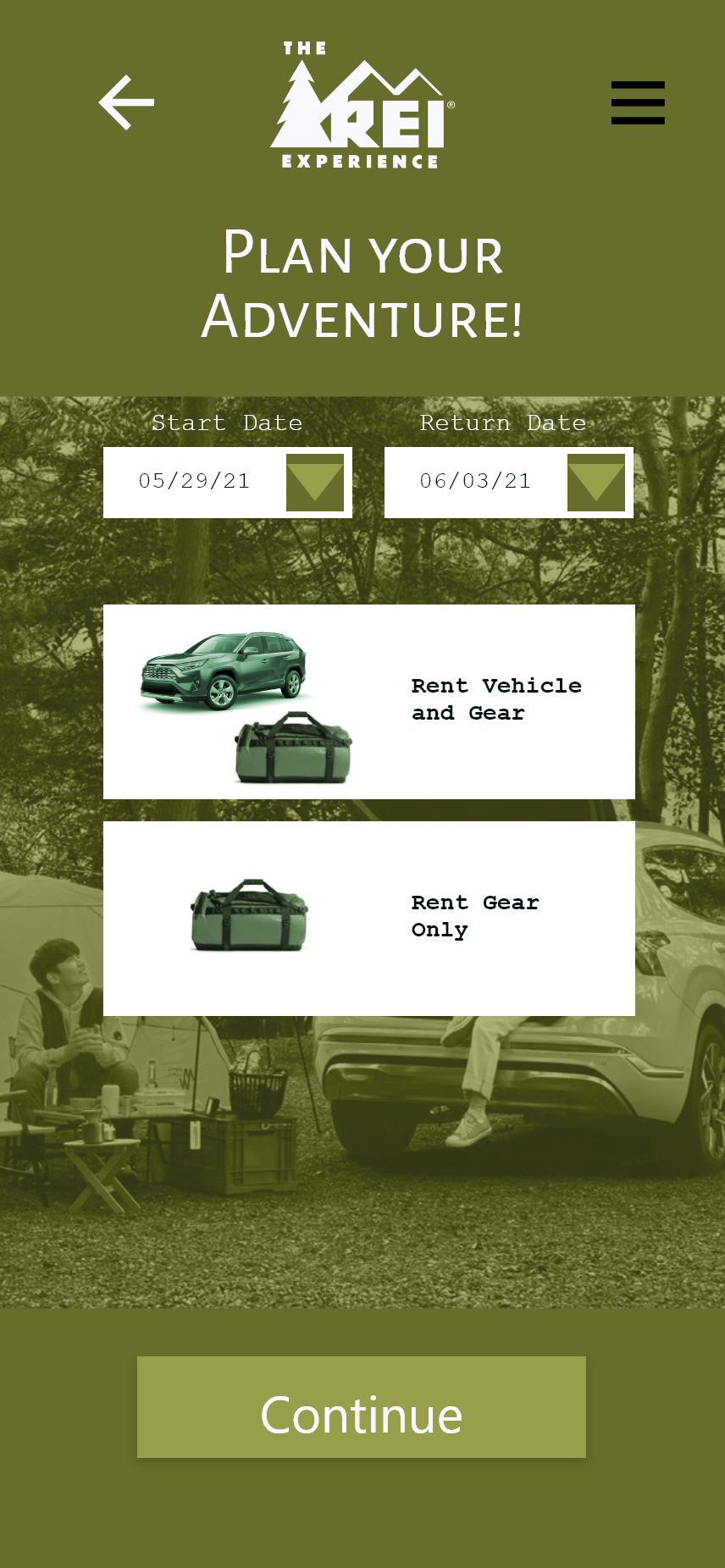
Prototype 1 rental choices
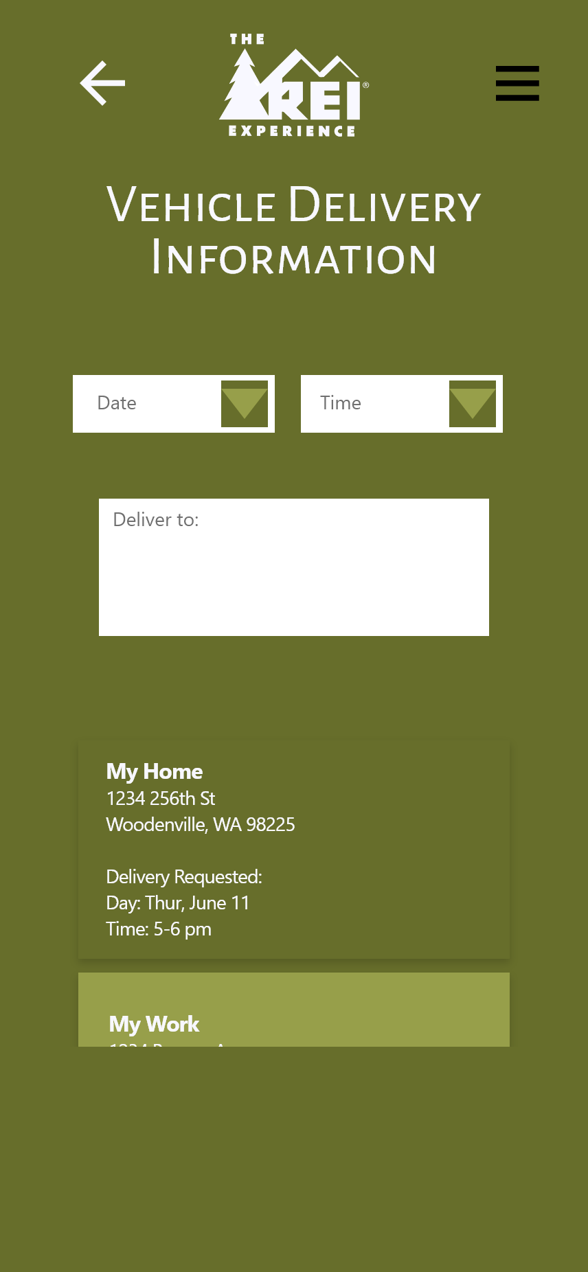
Prototype 1 delivery
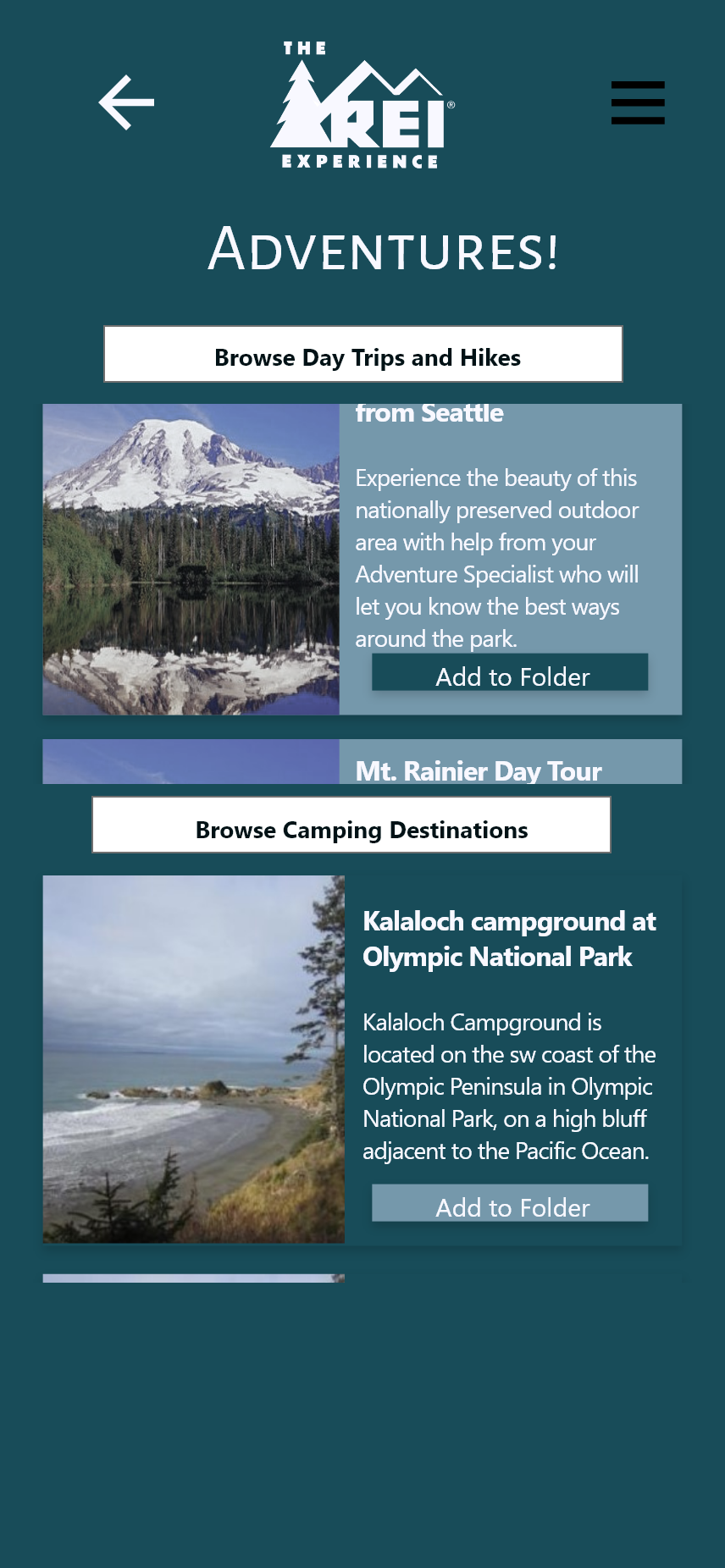
Prototype 1 adventures
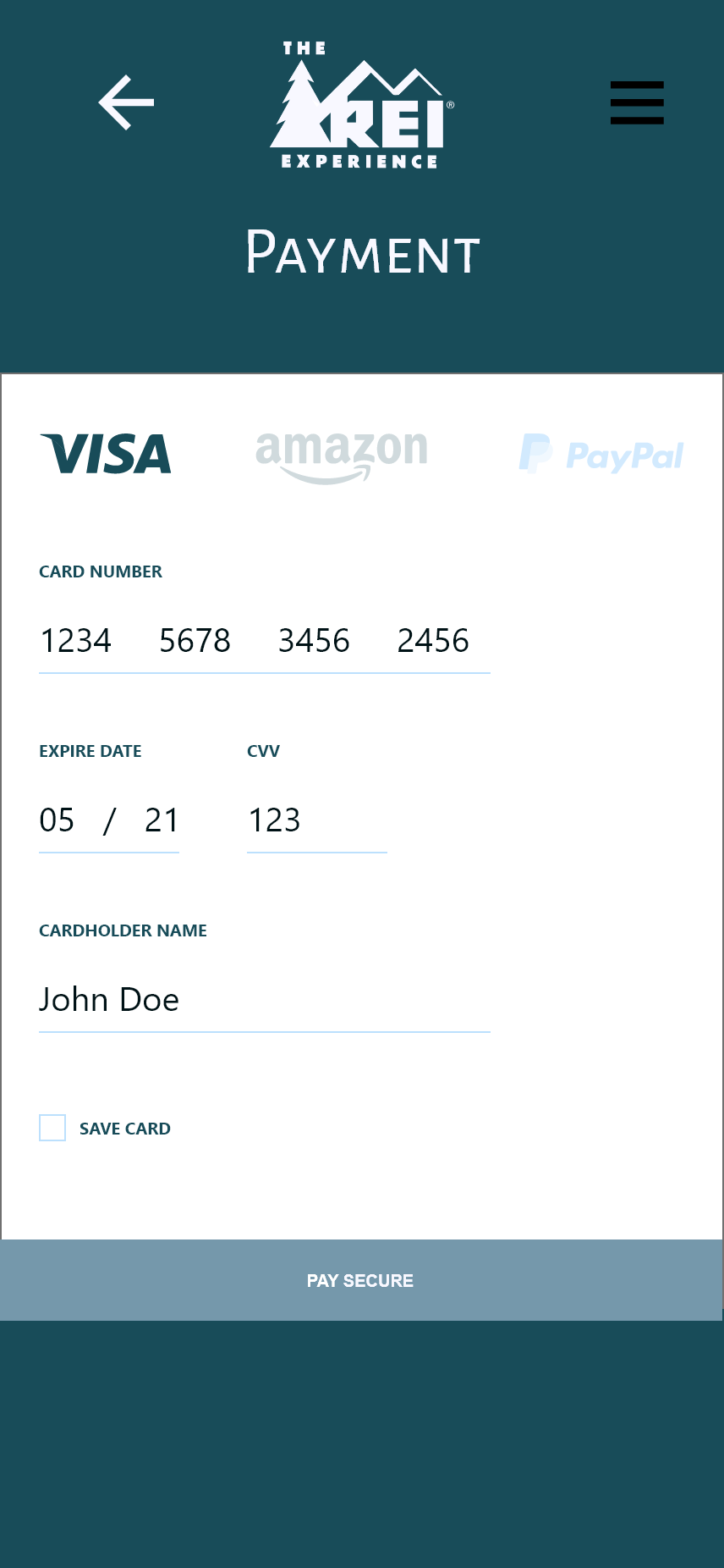
Prototype 1 payments
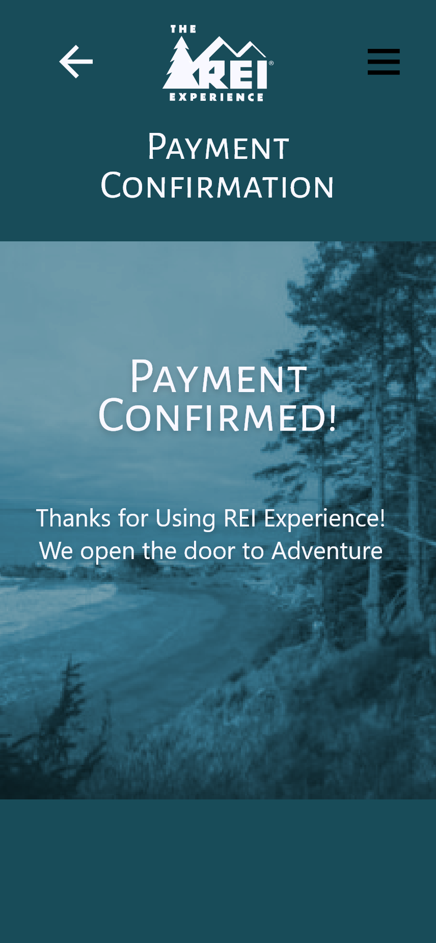
Prototype 1 confirmation
Learning From Our Prototypes
From user testing feedback moved to a second prototype. We created a cleaner, simpler design that used mental patterns more familiar to our users. As a result, we received better information from our testers.
User Testing From Prototype 2
After restructuring the app to be event-driven and deleting the colored backgrounds our testers were able to give more feedback on the flow and functionality of the app. Based on feedback, our users:
asked for even more flexibility to choose car types
based on trips they liked.
wanted the option to chat with specialists while
still in the initial planning stage.
wanted to see a running total of charges as they
added elements to their package.
liked the improved look of the app.
based on trips they liked.
wanted the option to chat with specialists while
still in the initial planning stage.
wanted to see a running total of charges as they
added elements to their package.
liked the improved look of the app.
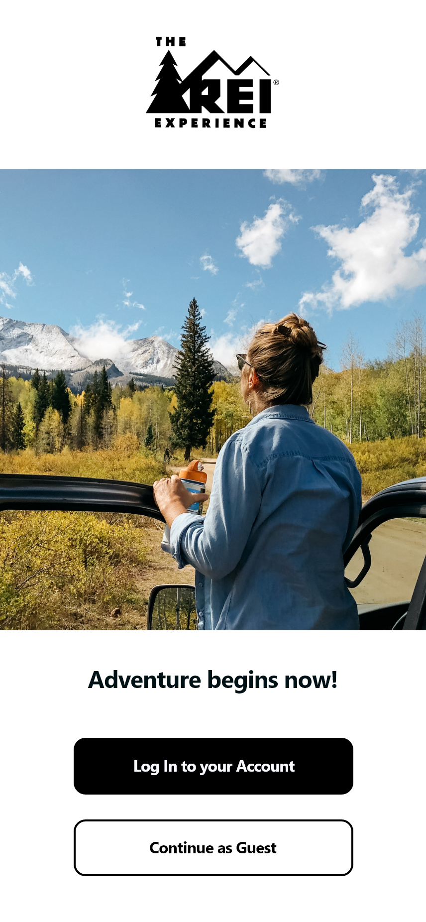
Prototype 2 Splash
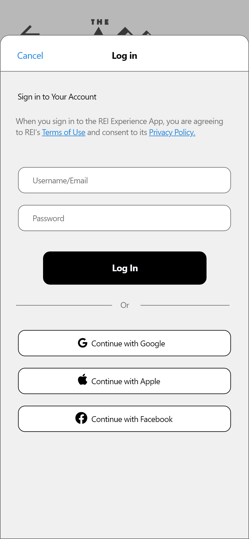
Prototype 2 Log In
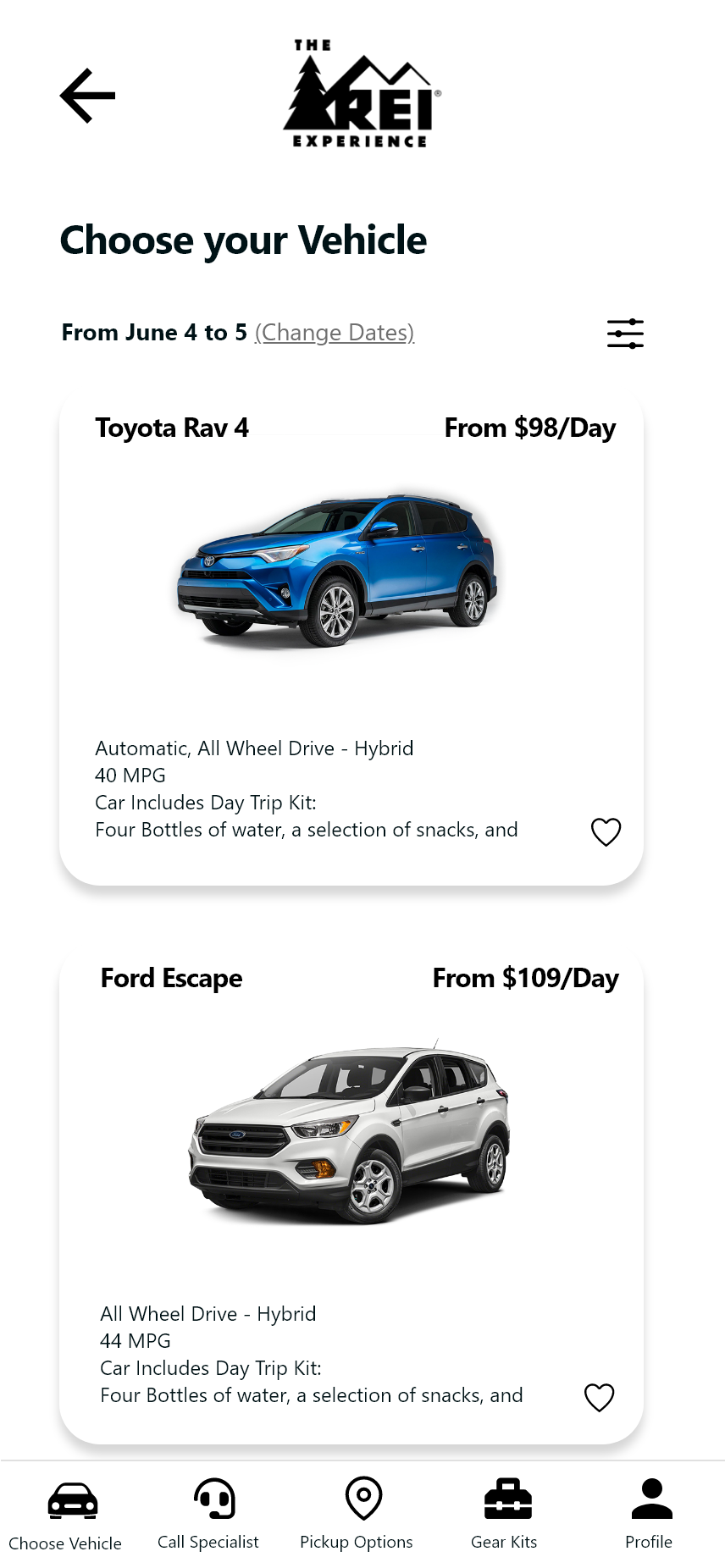
Prototype 2 Vehicle choice
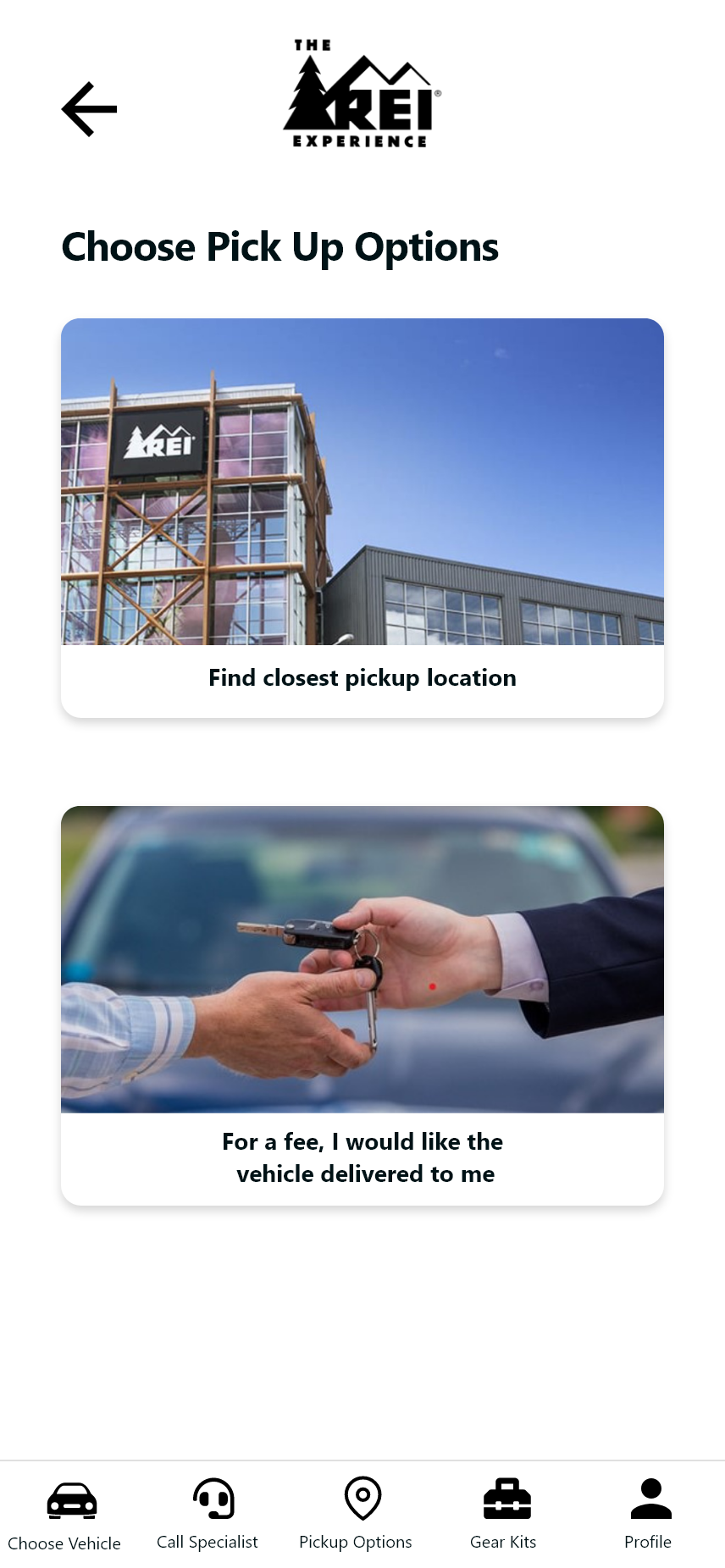
Prototype 2 Pick up options
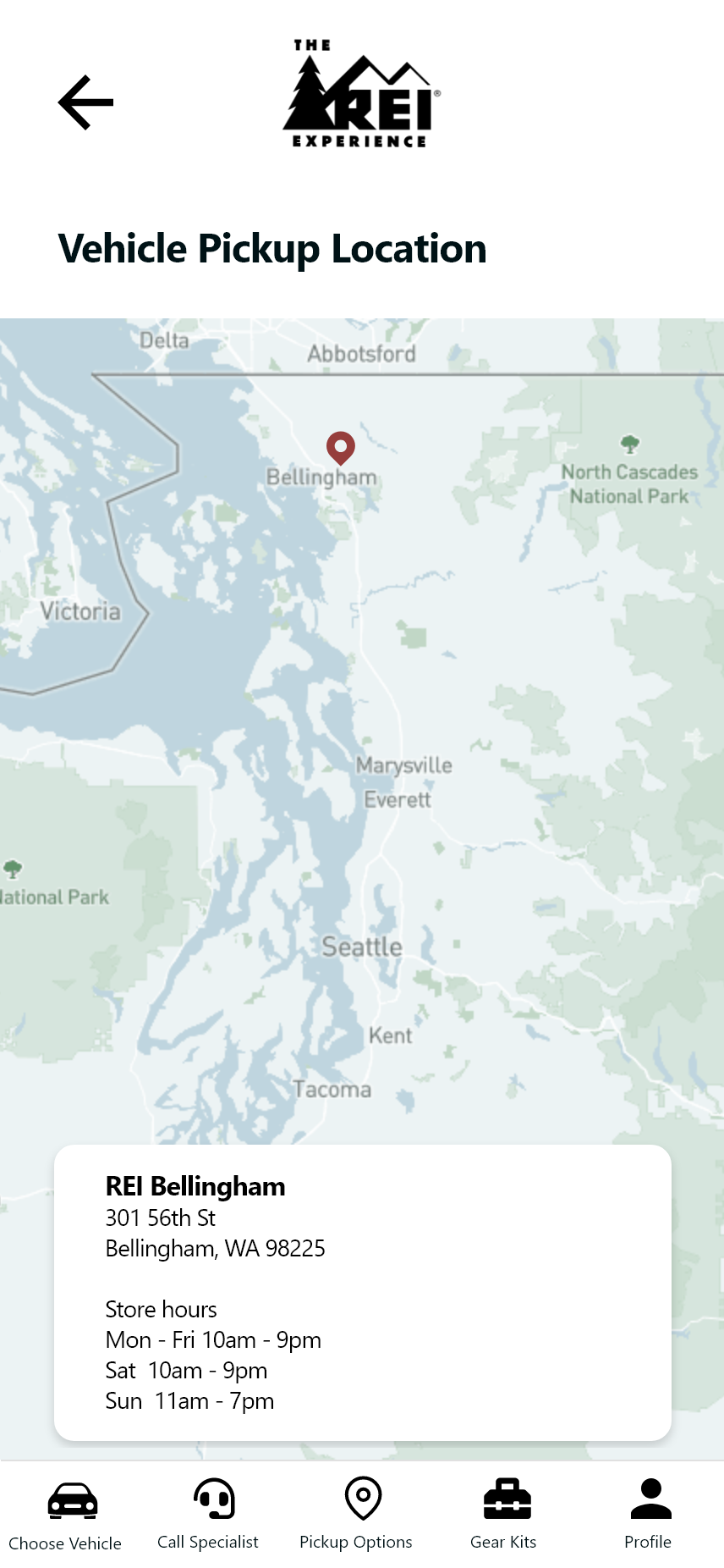
Prototype 2 Pick up location
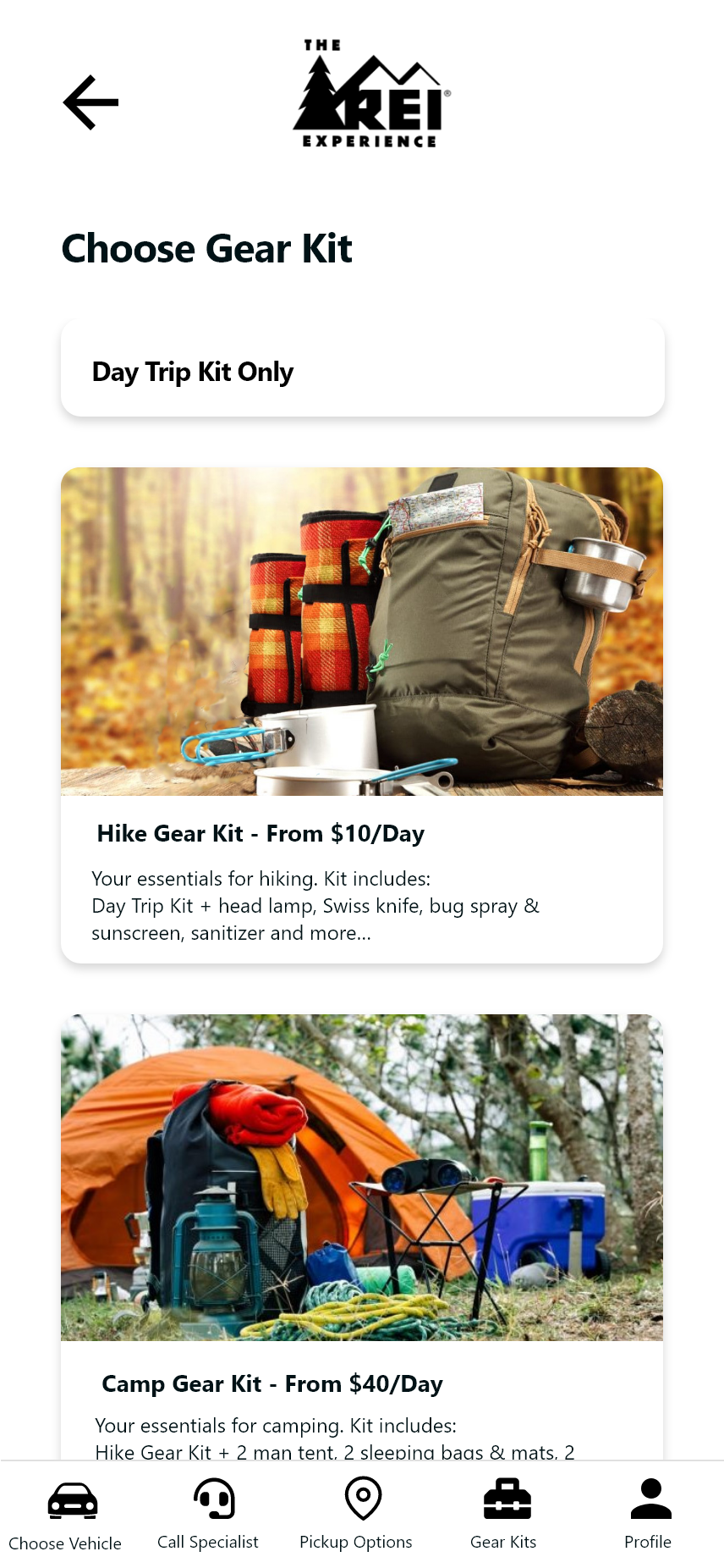
Prototype 2 Gear select
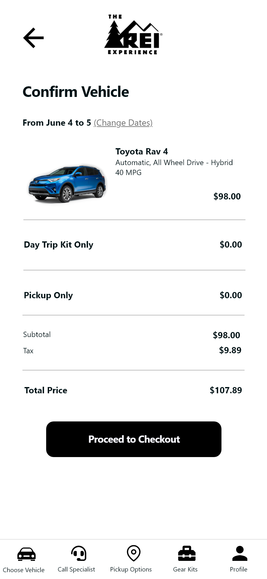
Prototype 2 vehicle confirmation
Prototype 2 Logo
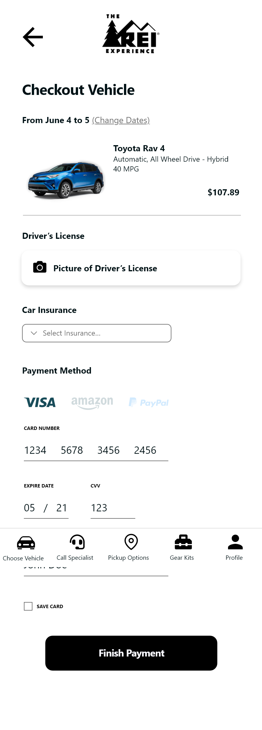
Prototype 2 Check out pay
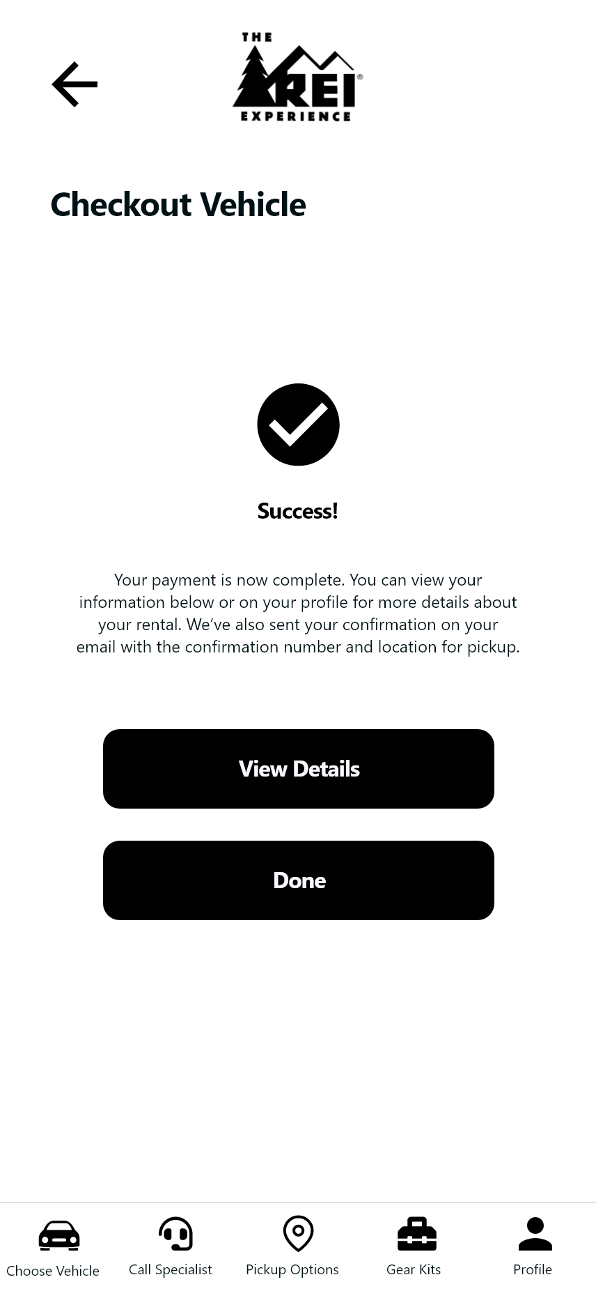
Prototype 2 Pay confirmation
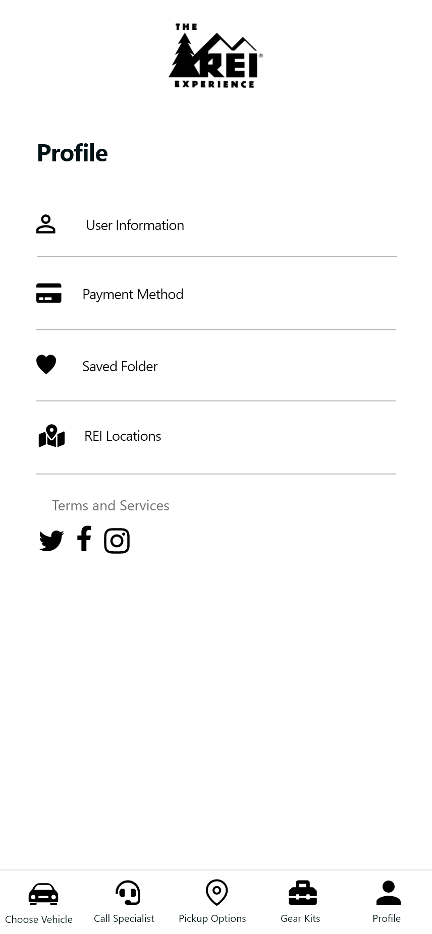
Prototype 2 Profile
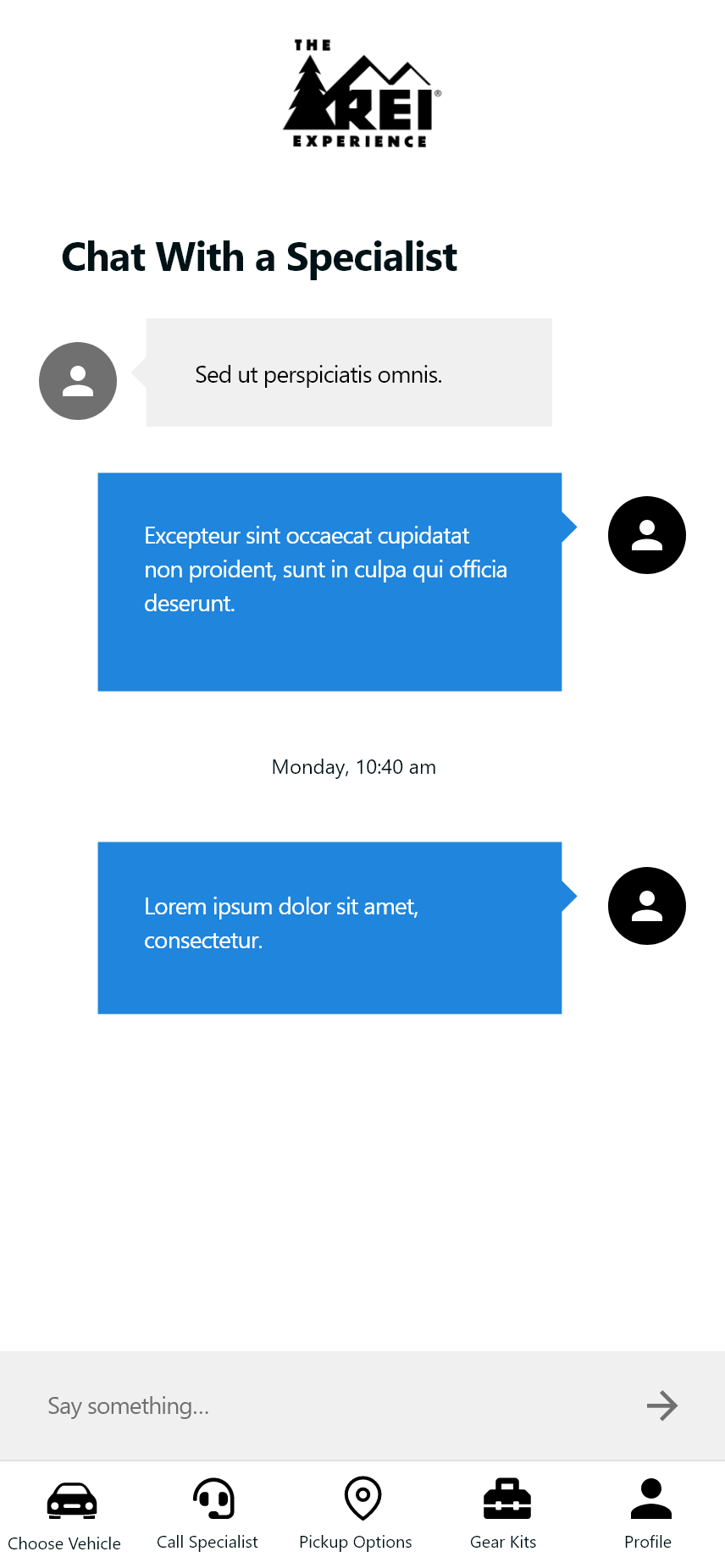
Prototype 2 Chat
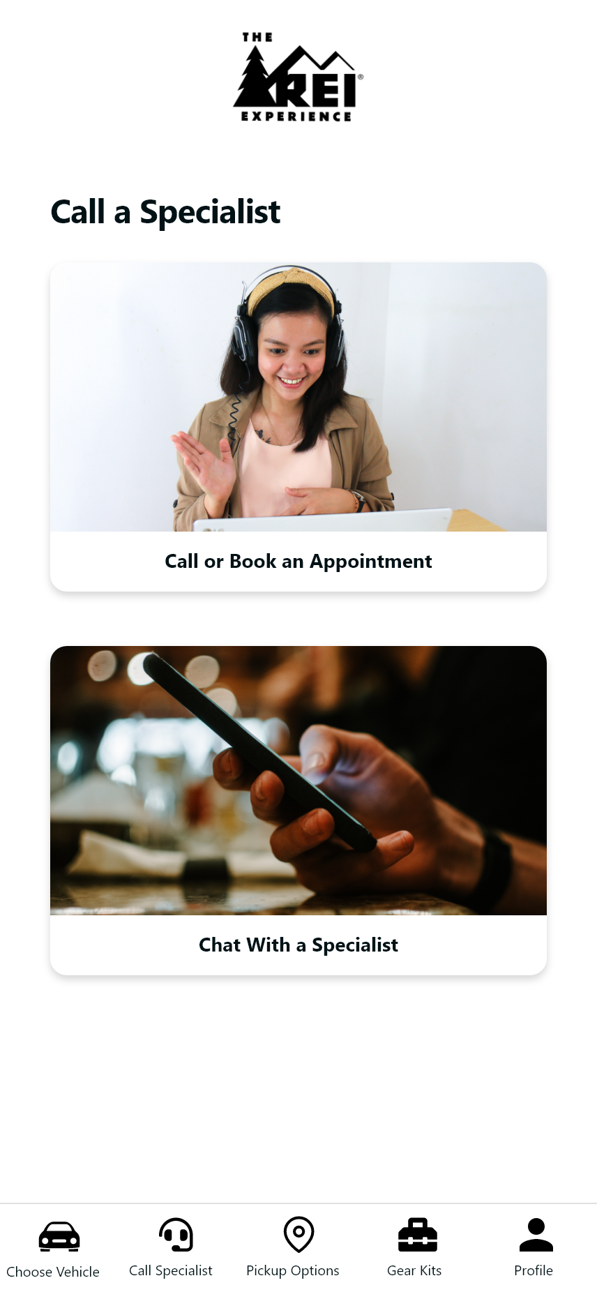
Prototype 2 Contact specialist
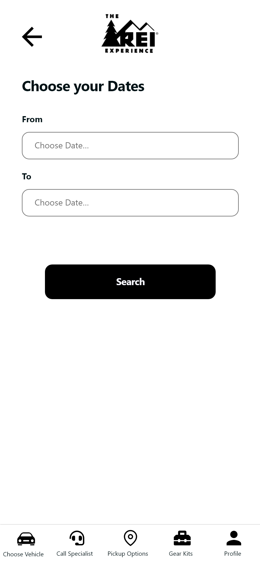
Prototype 2 Calendar
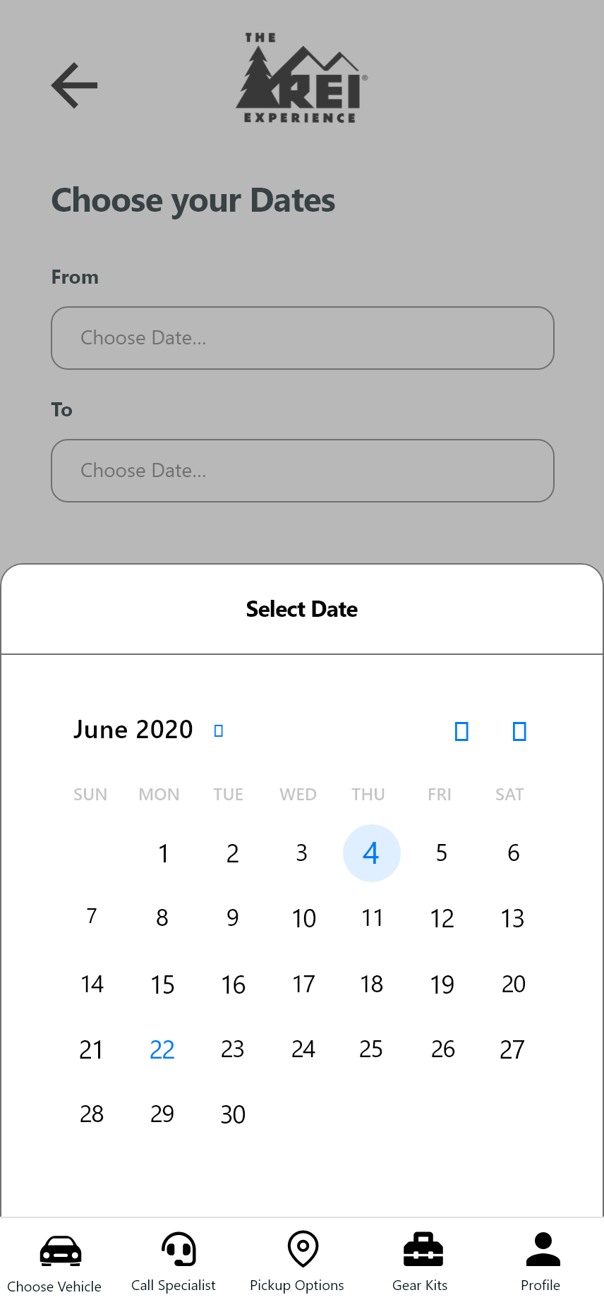
Prototype 2 Calendar modal
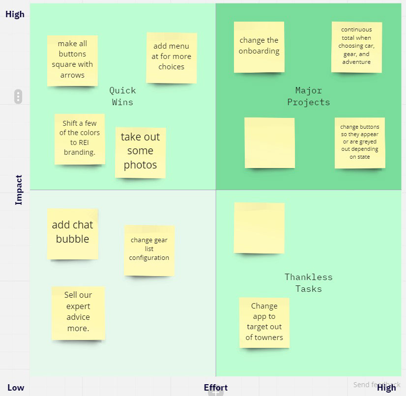
Finding Quick High-Impact Improvements For Future Prototypes
As we finished the second round of testing we knew we would need more rounds, we used an action priority matrix to analyze what improvements we could make on the next round that would have the highest impact. Going forward we would address the quick wins first.