Our team worked together to create a car camping rental experience that might be used by REI to further expand its customer base and build more trust from outdoor enthusiasts.
Problem
How might we create a flexible rental car camping experience for urban outdoor enthusiasts that they will trust and use?
Goal
To create a mobile application where urbanites who want to camp can rent a car and gear all at once. The application will use name-brand recognition to garner trust between the user and the app.
Solution
Through the app, REI will be able to leverage its large community of outdoor experts to help people experience the perfect outdoor adventure. The user will use the app to rent a car along with gear packages that have been curated by experienced campers so the user can concentrate on the adventure ahead. The app features brands like Subaru and REI to create trust and promote those products.
My Roles
Collaborating with Ana Bungag, my roles were:
Web Design, UX Research, Service Design, Branding
Web Design, UX Research, Service Design, Branding
Skills: Site Mapping, Typography, Ideation, Problem Solving.
Four Phases of Development
1. Identify the User's Needs
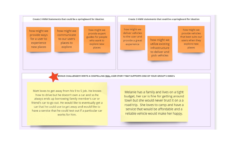
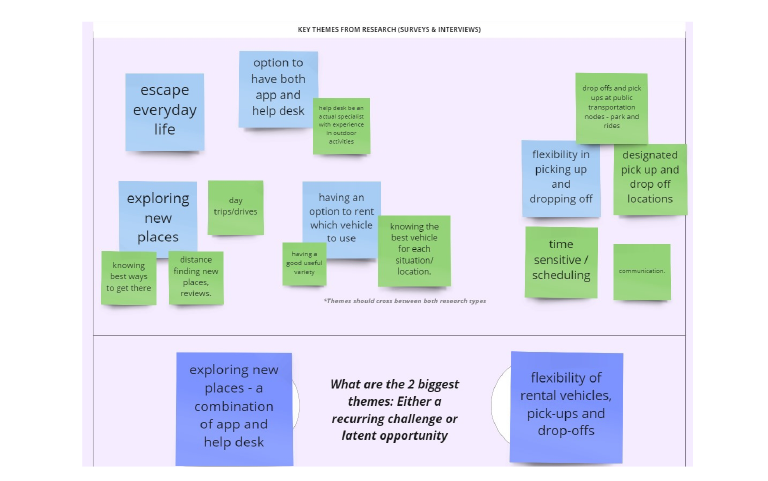
We gathered information from a survey of Seattle urbanites, conducted interviews, and researched our competitors to find out as much as we could about our target users. We created personas based on our research and explored what needs they had.
2. Design for User's Needs
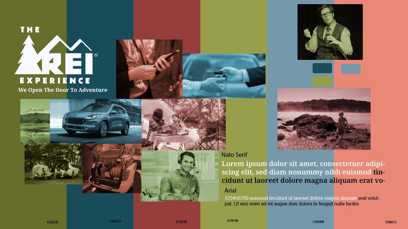
Moodboard
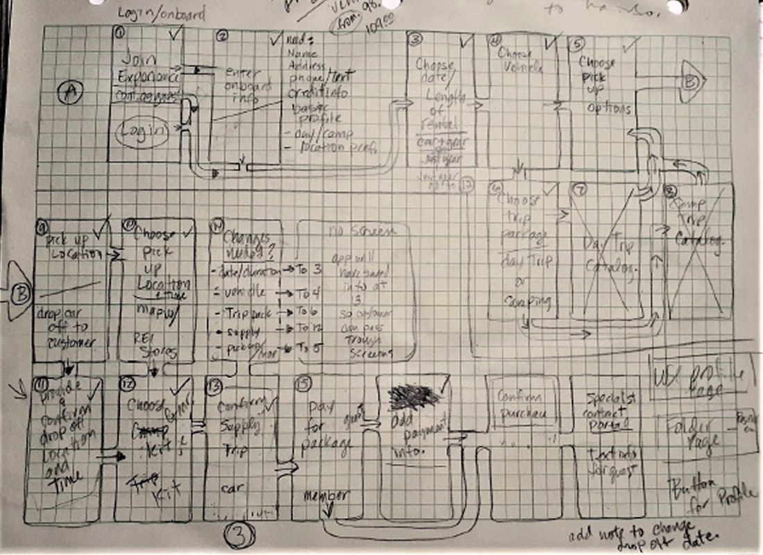
User Flow
The research helped us to know what jobs this car camping rental app should do for our users. Once the key features were decided, we worked to decide the look and feel of the app. We mapped out how the user might move through the app.
3. Prototype and Testing
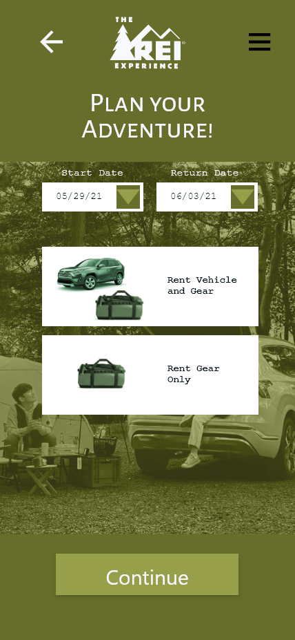
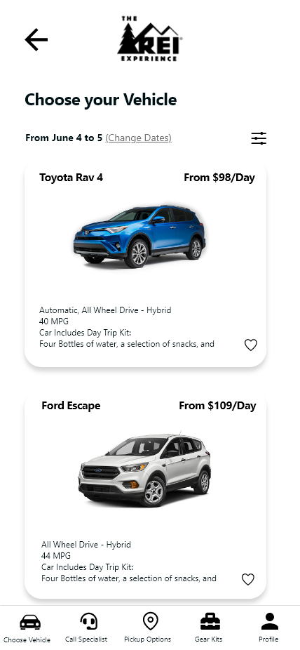
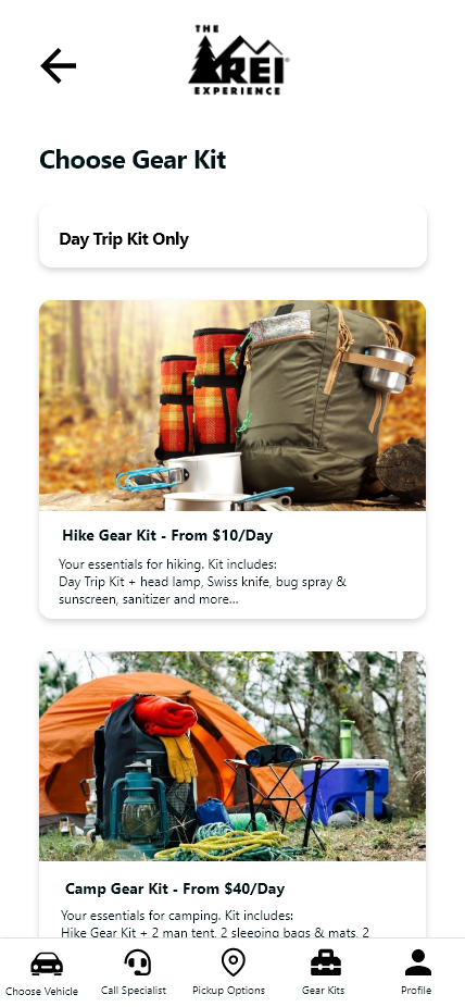
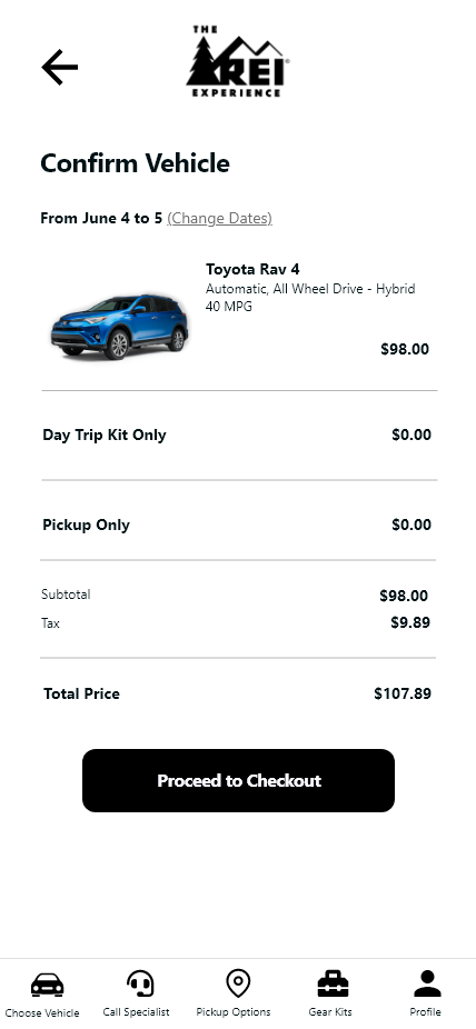
Using our User Flow and Wireframe sketches, we built our prototype and tested it through two rounds. There was a great change between the first and second prototypes for the better.
4. Attract and Direct Users
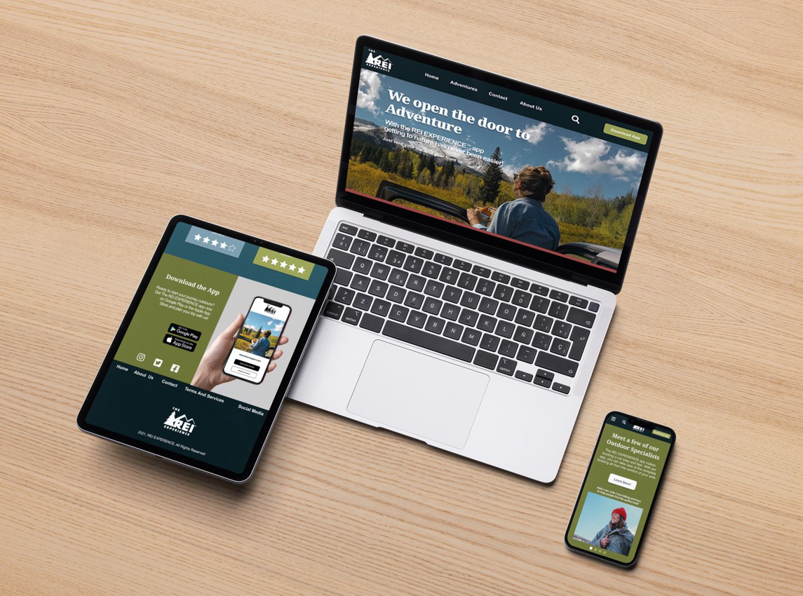
Responsive Landing Page
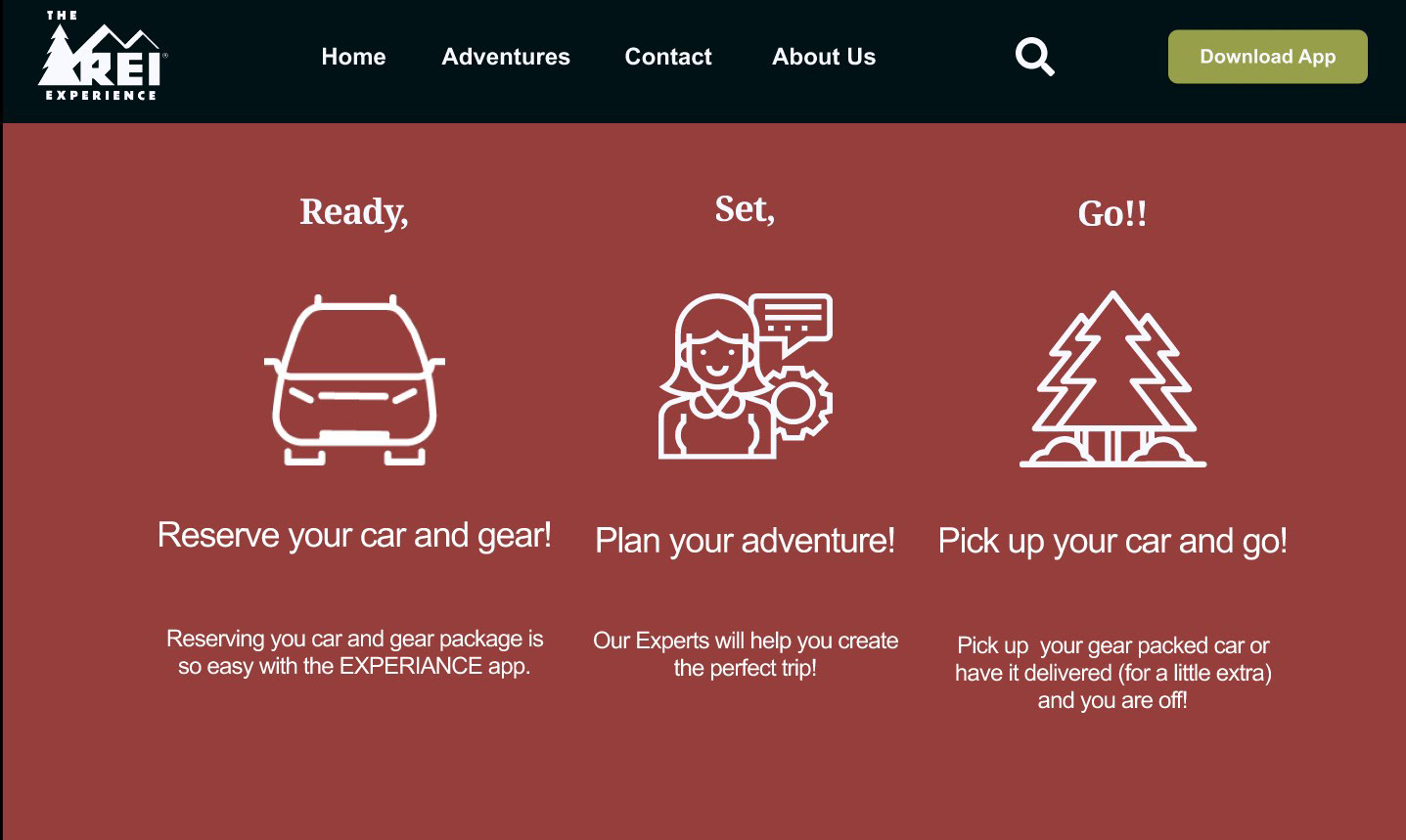
App Summary Section of Landing Page
We used Figma to wireframe a high-fidelity landing page. Users would be directed to the landing page through social media and local product placement through the REI home page with an email campaign launched to current members.
What We Accomplished And
Where To Next
Where To Next
Looking back over the project, we created a great opportunity to capture an underserved urban demographic that is eager to get to the outdoors.
We would improve the app by smoothing out transitions from one section to another and bringing back a little of the color we had to discard in the second prototype. We would also continue to refine buttons
to minimize distractions.
We would improve the app by smoothing out transitions from one section to another and bringing back a little of the color we had to discard in the second prototype. We would also continue to refine buttons
to minimize distractions.
The REI Experience App Is Easy To Use
With the program’s highly selective vehicle choices, the user is not overwhelmed with unnecessary details.
The base gear set packages are well-vetted and could be
customizable based on interactions between the user and
Experienced Outdoor Specialists.
With options for vehicle delivery, the REI Experience program would allow for exceptional customer/user service.
The base gear set packages are well-vetted and could be
customizable based on interactions between the user and
Experienced Outdoor Specialists.
With options for vehicle delivery, the REI Experience program would allow for exceptional customer/user service.
The App Pairs With Existing REI
Products And Services
Products And Services
The REI brand and customer base are a strong draw for automakers. A working relationship between companies would benefit both.
Renting gear along with the vehicle gives REI another window of opportunity to increase the “new” customer base as renters become familiar with REI’s exceptional product.
Exceptional Customer/User service always
contributes to brand loyalty.
Renting gear along with the vehicle gives REI another window of opportunity to increase the “new” customer base as renters become familiar with REI’s exceptional product.
Exceptional Customer/User service always
contributes to brand loyalty.
