Jobs To Be Done
The research helped us to know what jobs this car camping rental app should do for our users.
Car Camp App Key Features:
Reservation (main feature)
Car delivery option
Car pick up/Drop at convenient locations
Ease of pay
Expert advice on call, getting the most out of experiences
Carefully crafted camping packages
Carefully crafted day trip packages
Car delivery option
Car pick up/Drop at convenient locations
Ease of pay
Expert advice on call, getting the most out of experiences
Carefully crafted camping packages
Carefully crafted day trip packages
Ideation
With the key features decided, we went to work on how the app would look and how it would do its job.
Color And Style
Since the app was to be included under the REI co-op brand, we used a color pallet and font that could sit next to the REI brand as a point to start. We reinterpreted the look of the brand to be a little more intense but still preserve the humanness of REI.
We thought at first that this intensity would be fine for the app, but it tended to distract the user and confuse them. We ended up, in the long run, going with a cleaner look that employed more open space. We utilized more intense colors on the landing page to help convey excitement for the product.
We thought at first that this intensity would be fine for the app, but it tended to distract the user and confuse them. We ended up, in the long run, going with a cleaner look that employed more open space. We utilized more intense colors on the landing page to help convey excitement for the product.
Mental Modeling
We started with car and camping reservation patterns and were hoping to keep strong color blocking. We wanted a structure that was event-driven but also realized that a total event-driven flow would be complicated by holding temporary reservations while the user browsed through gear and adventure packages.
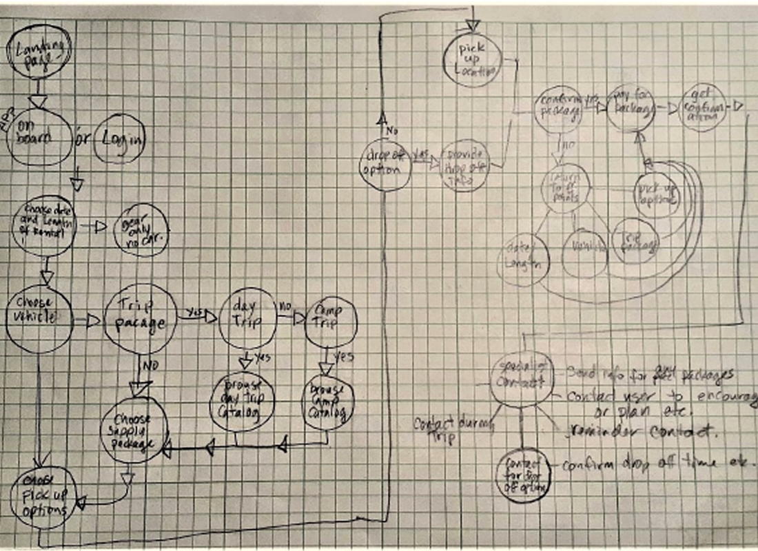
User Task Flow
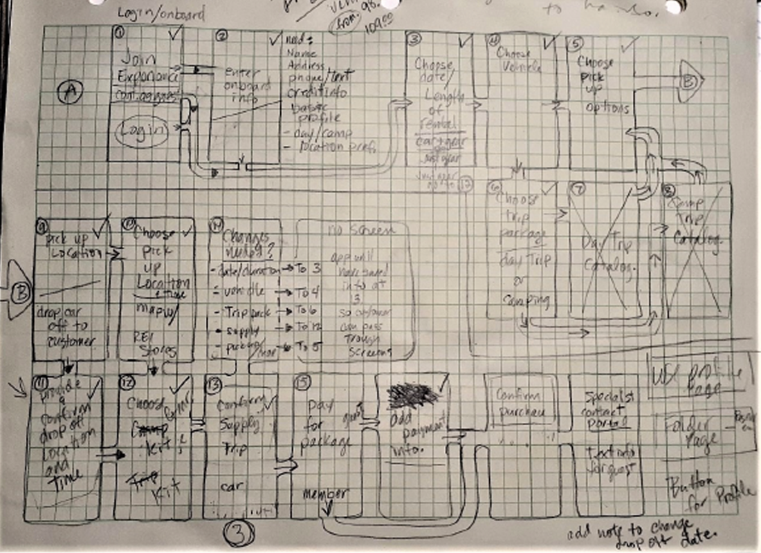
We mapped out the user task flow so we could begin to know how many modules the app would require and develop the basic structure required to accommodate the key services we planned to offer.
Preliminary Wire Frame
We then moved from the user flow to a preliminary wireframe; we began to visualize and work out different ideas about how each service might function

User Flow Sketch

